This post is a part of the #RPGaDAY series for 2017 by David F. Chapman and RPGBrigade. For more information, see this post at AUTOCRATIK. I'm modifying per suggestions from S. John Ross as well as applying my own interpretations. Comment with your answers or links to your own posts!
Day 12 - Which RPG has the most inspiring interior art?
Once again, I'm removing the superlative from this question. I love good RPG art. I love when the art sets the tone for the game, insofar as it communicates the tone that the designer intended. I'm a big believer in the rules of a game driving a particular style of play, and if a rules designer has done their job, that should be communicated well through actually playing the game, i.e. interacting with the rules. If the writer has done their job, it's communicated through the text. If the art director and artist have done their jobs, it's beamed straight into your brain through the artwork and hopefully evokes memories, associations, or feelings that tell you what this game is about. For games less reliant on rules as a genre-enforcer, I feel that the art becomes even more important, since it gives me a frame of reference I can use to "paint" the setting and the scenes, and maybe even the characters. I want to know what kind of world they inhabit. I want to know how they feel. The game's art, hopefully, communicates that to me.
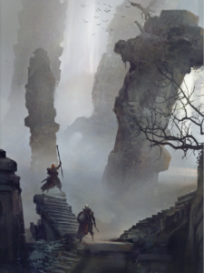
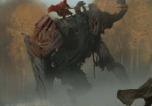
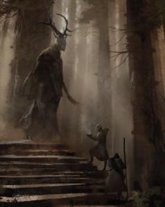
A standout game for me in this arena is the Swedish dark fantasy game Symbaroum by Mattias Johnsson and Mattias Lilja, art by Martin Grip (recently translated into English and published through Modiphius). The illustrations in this book are, in a word, beautiful. The paintings are predominantly greys, browns, and dark, muted colors, maybe with occasional splashes of orange or red. The style is a particularly haunting kind of watercolor portraying a world filled with detail, but not through a crystal-clear lens by any means. My favorite pieces show grand, sweeping vistas with small figures; it gives me a sense of the scope of the world and the characters' places in it. The palette and scenery is spot-on for the tone of the game: dark, mysterious, and adventurous.
Further, I really enjoy pieces that highlight characters interacting with other beings, because there is an impressive sense of scale communicated. Things aren't shown so giant as to be out of the realm of being reasonable, but they are clearly still not operating on the same scale as human beings.
Just flipping through this book gets my heart rate up. I want to see that world; I want to be part of that adventure. This is one of my favorite books just to leaf through as an art book. The scenes are evocative and exciting, and it makes me want to play. What else could you want from your RPG art?
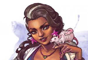
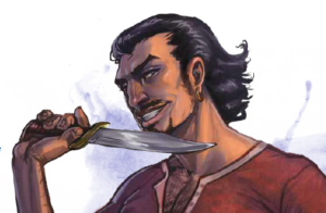
For today's question, I'm going to break my own rule and also offer a second answer, if only because I love the art, and to show the kind of difference artwork can make to how I perceive a game's tone. My second pick is Witch: Fated Souls by Elizabeth Chaipraditkul. The artwork that captures me most in this book is the character art for the Fates, illustrated by Aida de Ridder. Witch is another dark fantasy game, but contemporary in setting. Despite the genre being billed so similarly to that of Symbaroum, the character art tells me a completely different story. These are people I might hang out with, people I might see just around. It just happens that they're part of a dark and dangerous occult world that at any moment could turn me to dust and blow me away.
Bright colors, detailed features...aren't these just a couple of cool kids living their lives? I'm certain they get into all kinds of adventures, but this isn't the moss-riddled dark forest and your tenth straight day of overcast sky and soggy trail rations. This is downtown at the club or out for afternoon coffee at the trendy cafe. The forces coming into play in this game may be supernatural and dark, but that doesn't mean your characters can't have a little fun and be cool.
It's true that these were the two games that came to mind when I thought of my favorite interior art, but it was happenstance that they shared similar genre tags and yet presented in such different ways through their respective artwork. I think it makes a nice illustration of what artwork can mean to a game's presentation.
[CORRECTION: Originally I attributed the illustrations in Witch to Floor Coert. The artist is actually Aida de Ridder. This post has been corrected accordingly. My apologies to both Floor and Aida for the error, and thanks to Liz for the correction.]

